The result
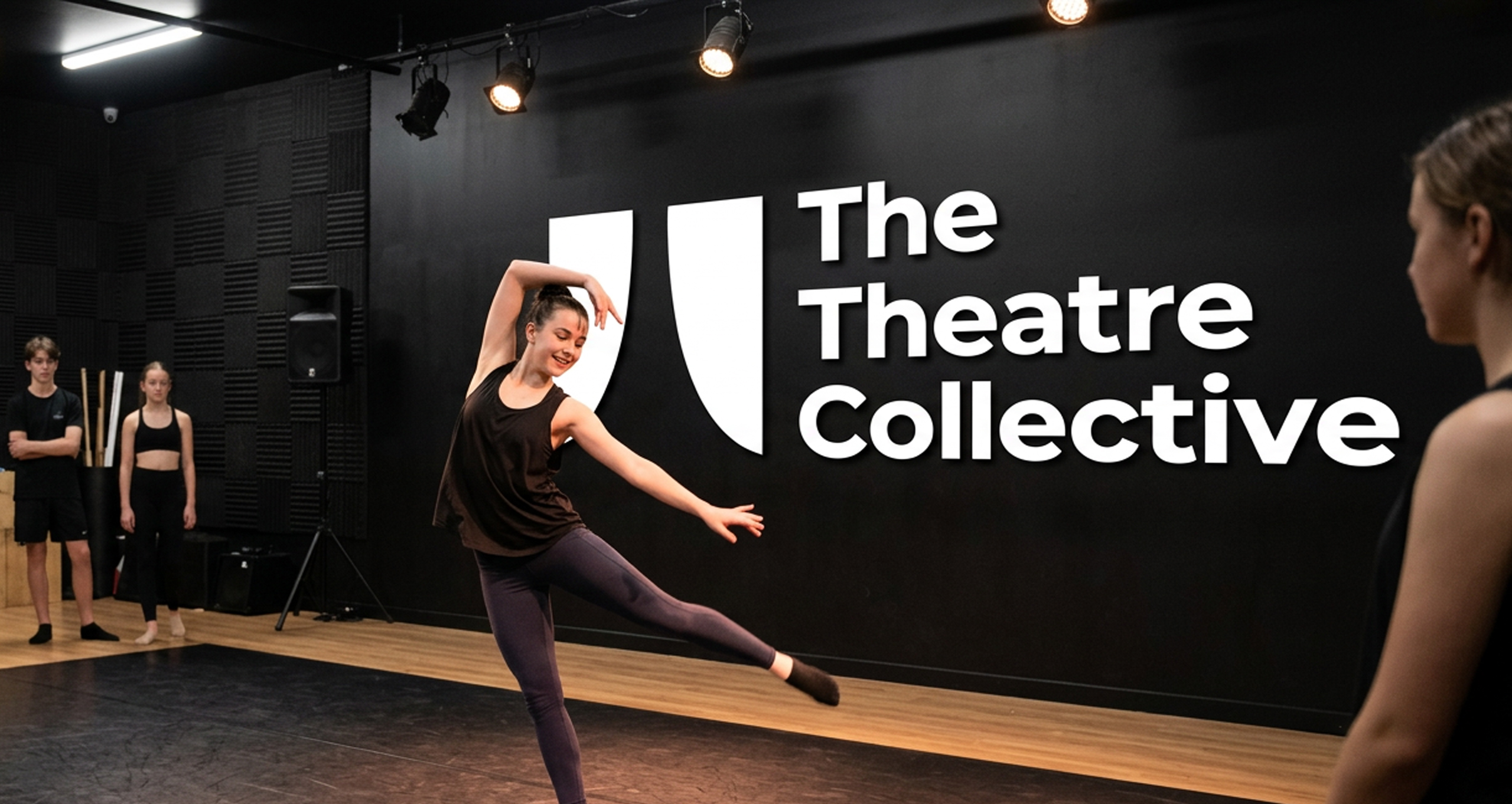
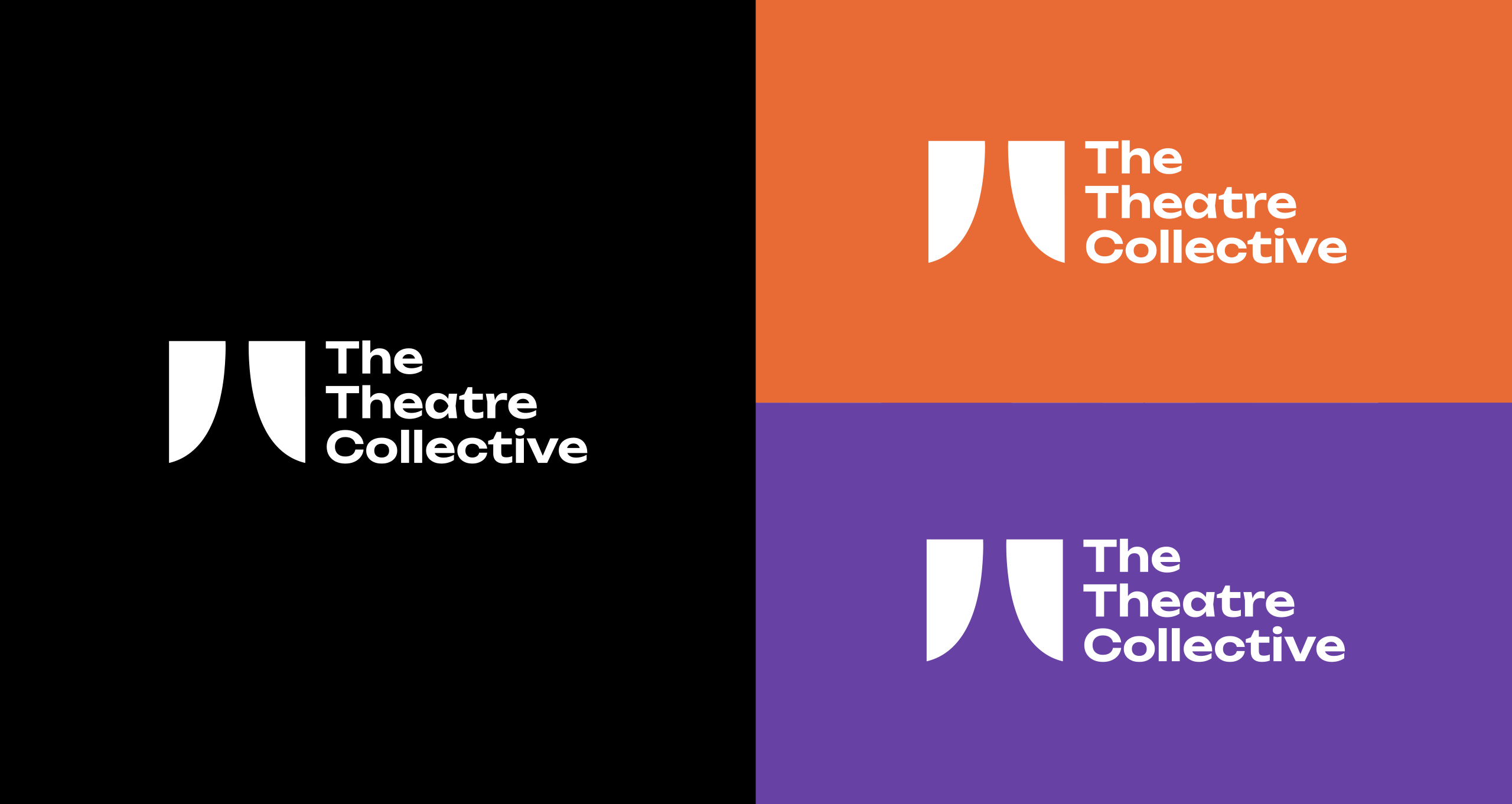
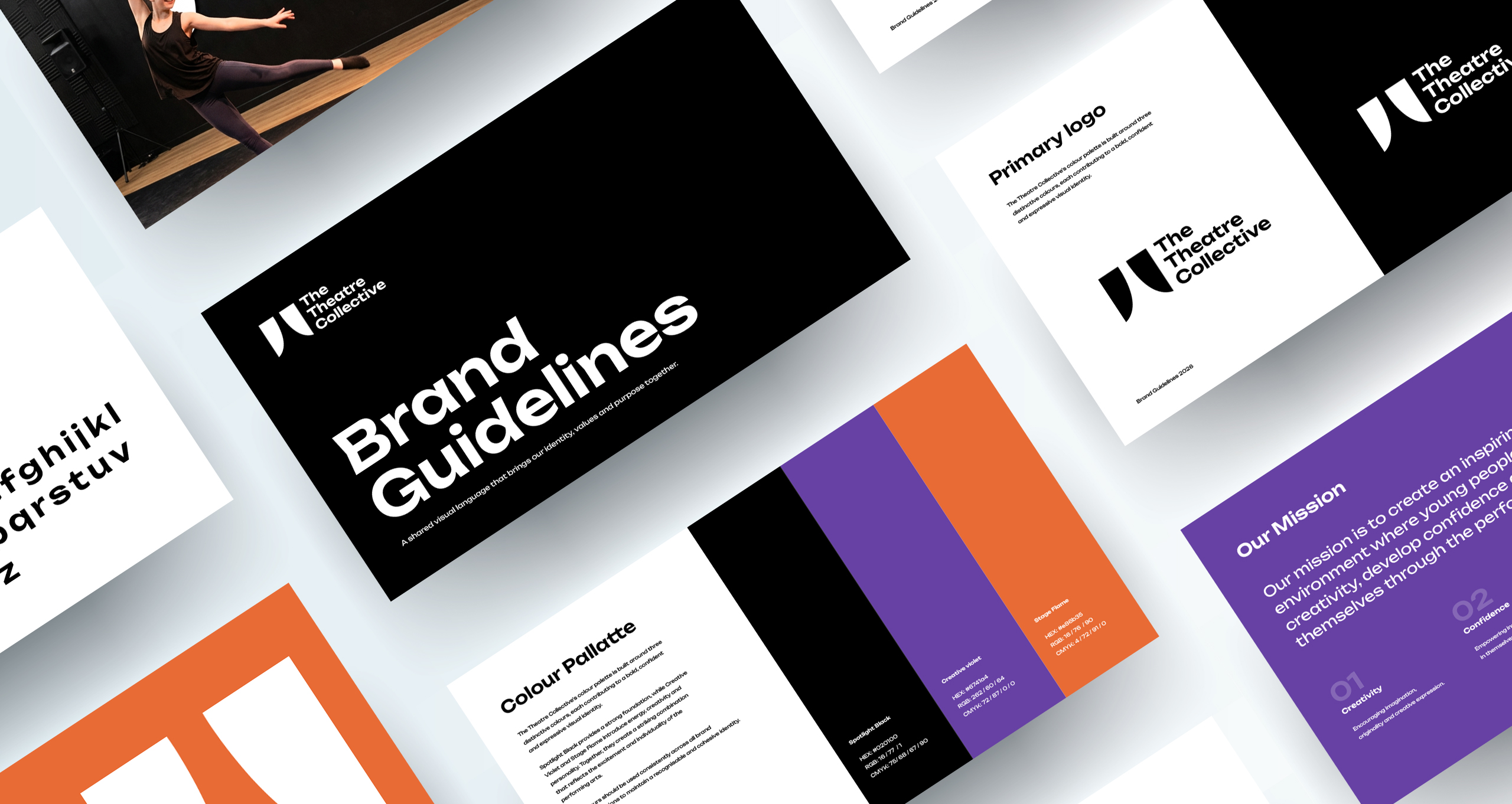
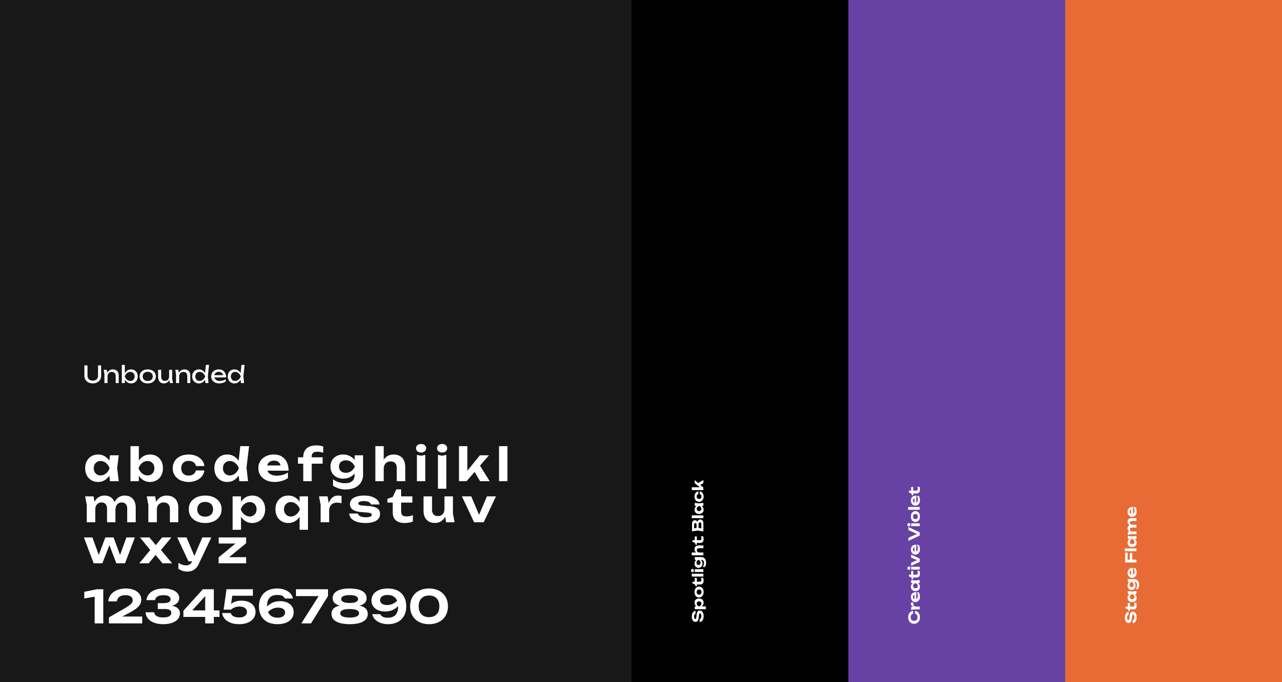
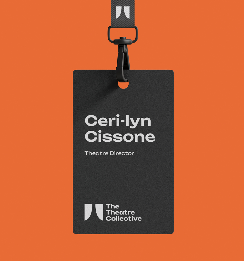
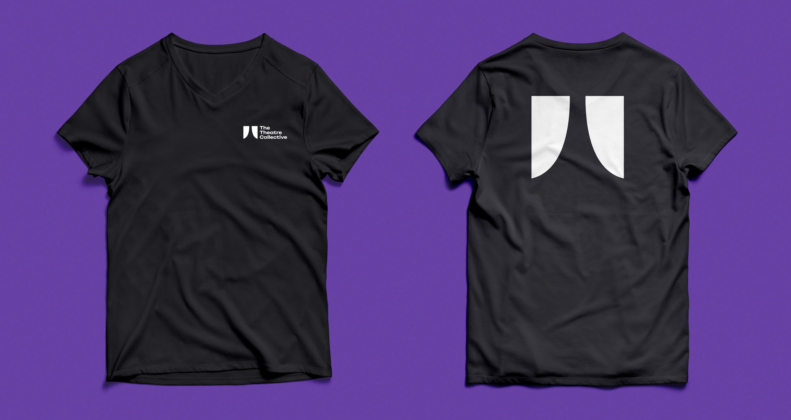
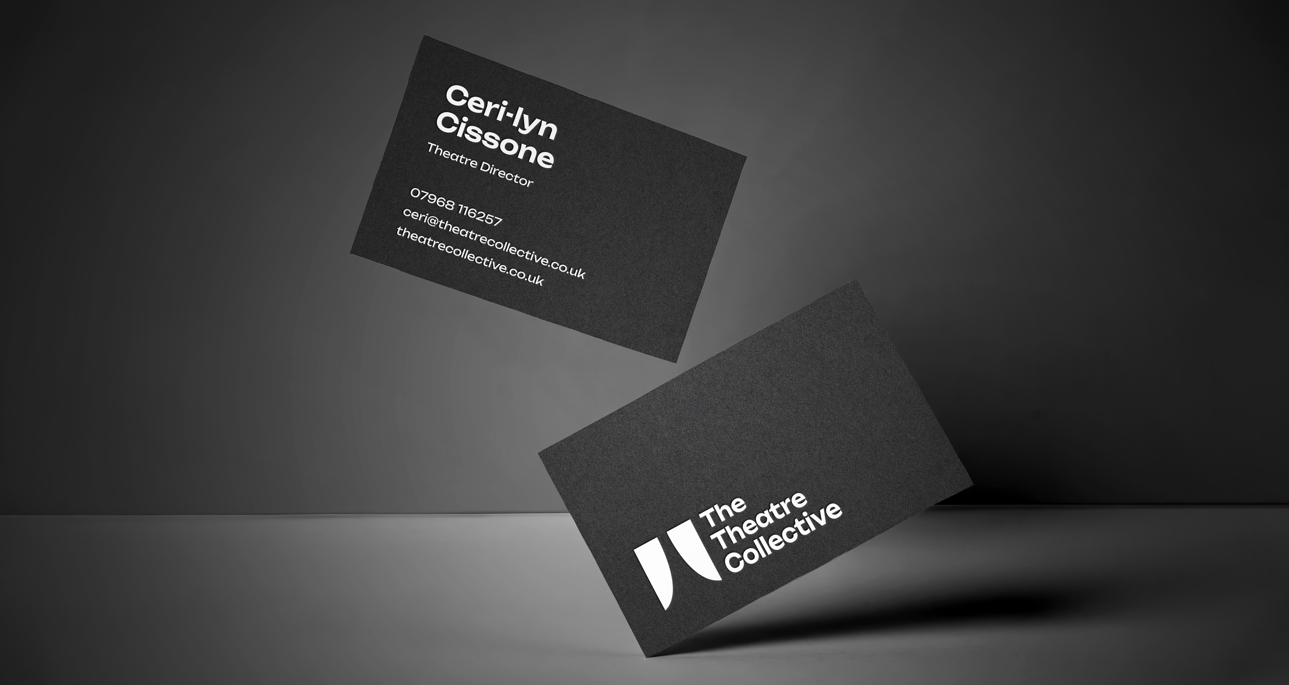
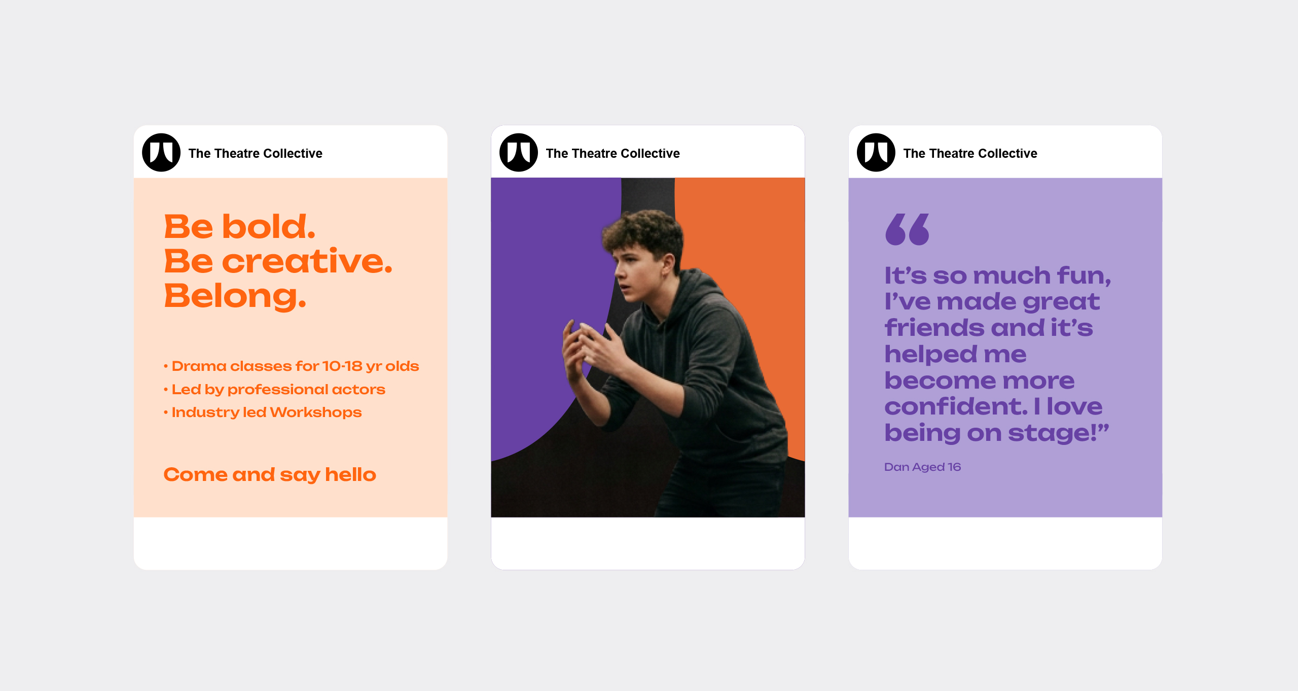
The resulting identity brings together bold typography, a confident colour palette and a distinctive visual style to create a brand with personality and presence. Using Unbounded as the primary typeface, the identity takes on a contemporary, expressive character that reflects the energy and individuality of the performing arts. The carefully selected colour palette combines Performance Black, alongside vibrant supporting colours, creating a strong visual foundation that is both recognisable and versatile.
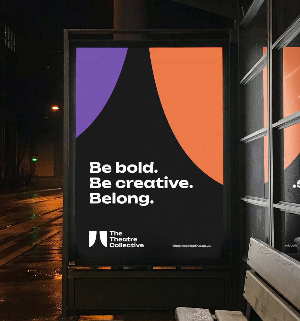
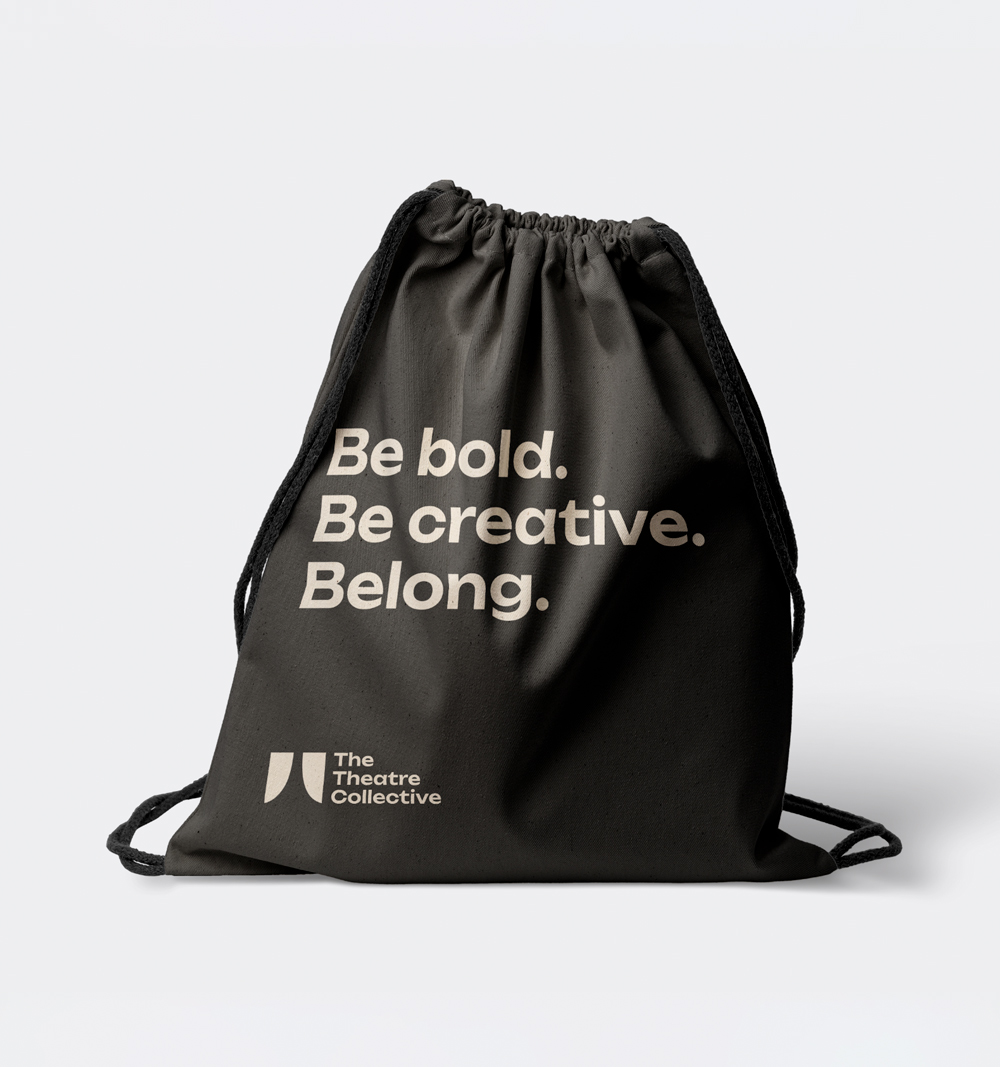
We also developed a supporting brand language built around the message:
Be bold. Be creative. Belong.
This captures the spirit of the company, encouraging young performers to express themselves, embrace new experiences and feel part of something.
The identity was extended across social media graphics and promotional applications, supported by a set of brand guidelines to ensure consistency as the company continues to grow. The result is a confident, contemporary identity that gives the company a distinctive voice and a visual platform to build upon.