Discovery and research
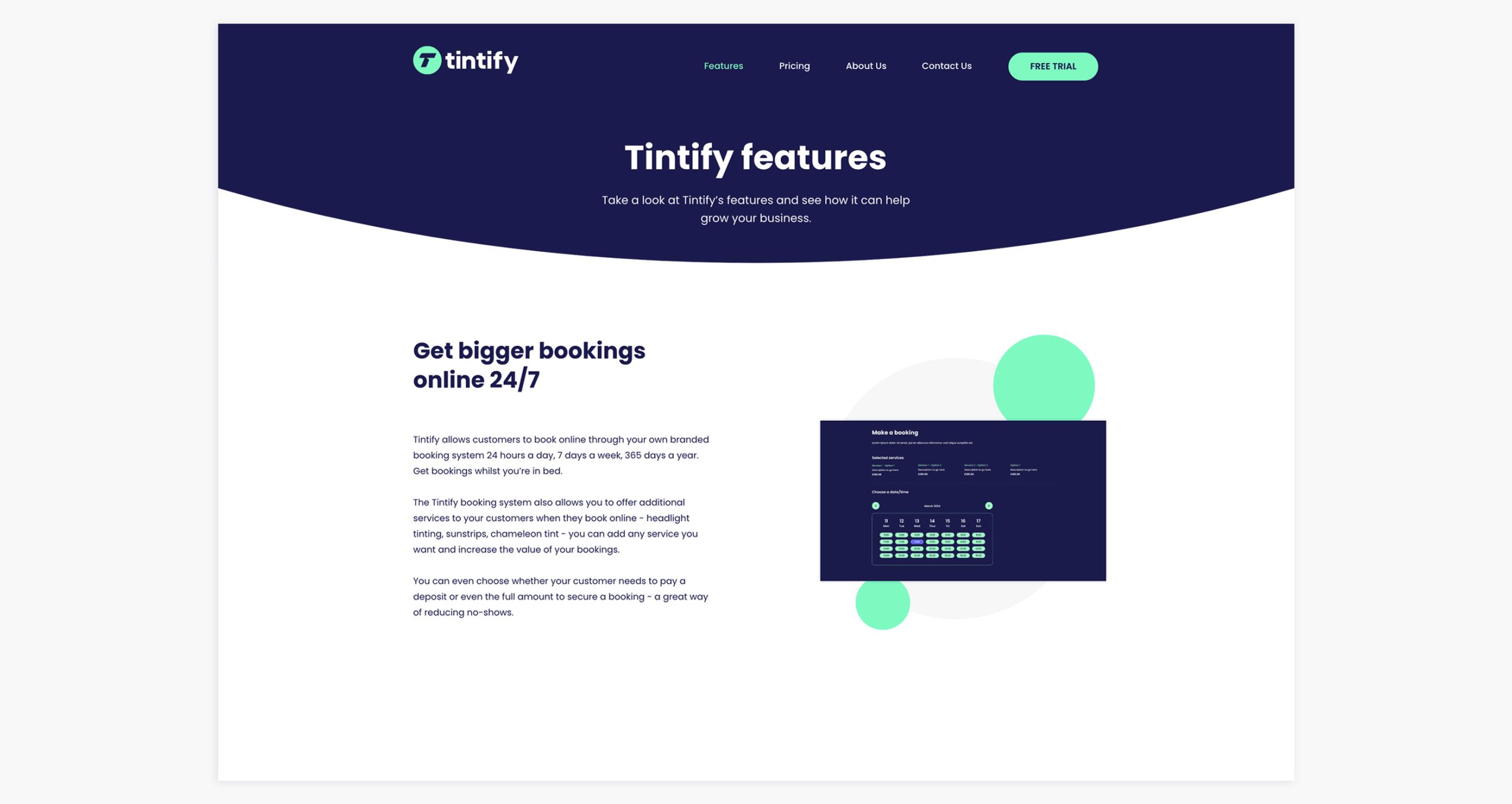
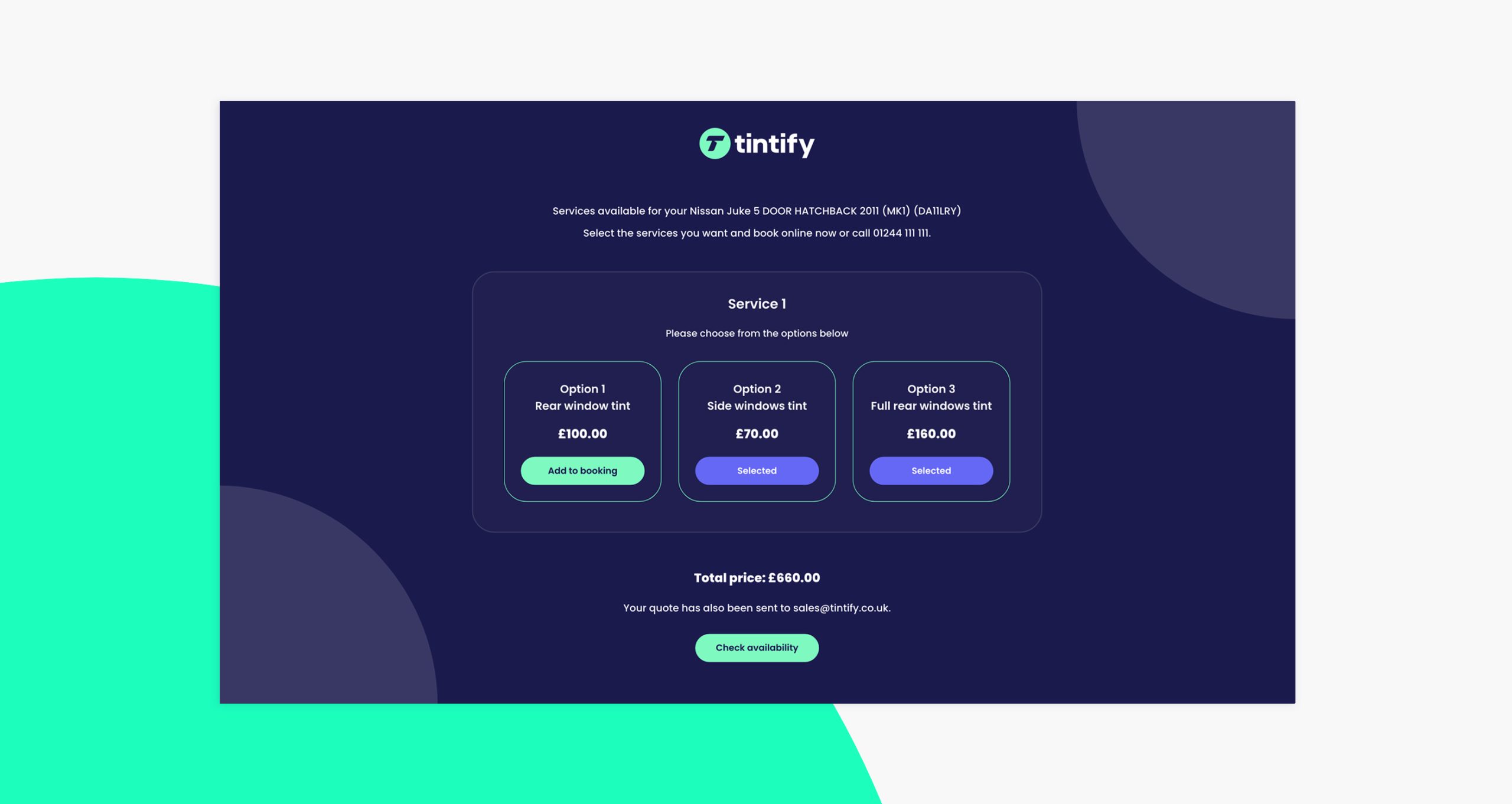
The Tintify booking system allows businesses to offer a variety of services to their customers when they book online – window tinting, headlight tinting, sunstrips and chameleon tint. They can add any service they want and increase the value of their bookings.
Our first task was to create a distinctive brand identity. The client sought a modern yet timeless logo. In response to the brief, we developed a logomark that cleverly integrated the letter ‘T’ and signified abstract shapes of car windows to form a modern and powerful icon.
We then ran multiple UX workshops with Tintify’s team defining the foundations of an intuitive suite of user flows and journeys, addressing the most important fucntionality for both the sales website and the booking system.
From the workshops we then developed wireframes and functional requirements, then applied these to a structure and information architecture. We then built a prototype for the new booking system and implemented a flexible testing strategy – ensuring feedback fom a variety of users was captured in a consistent format.
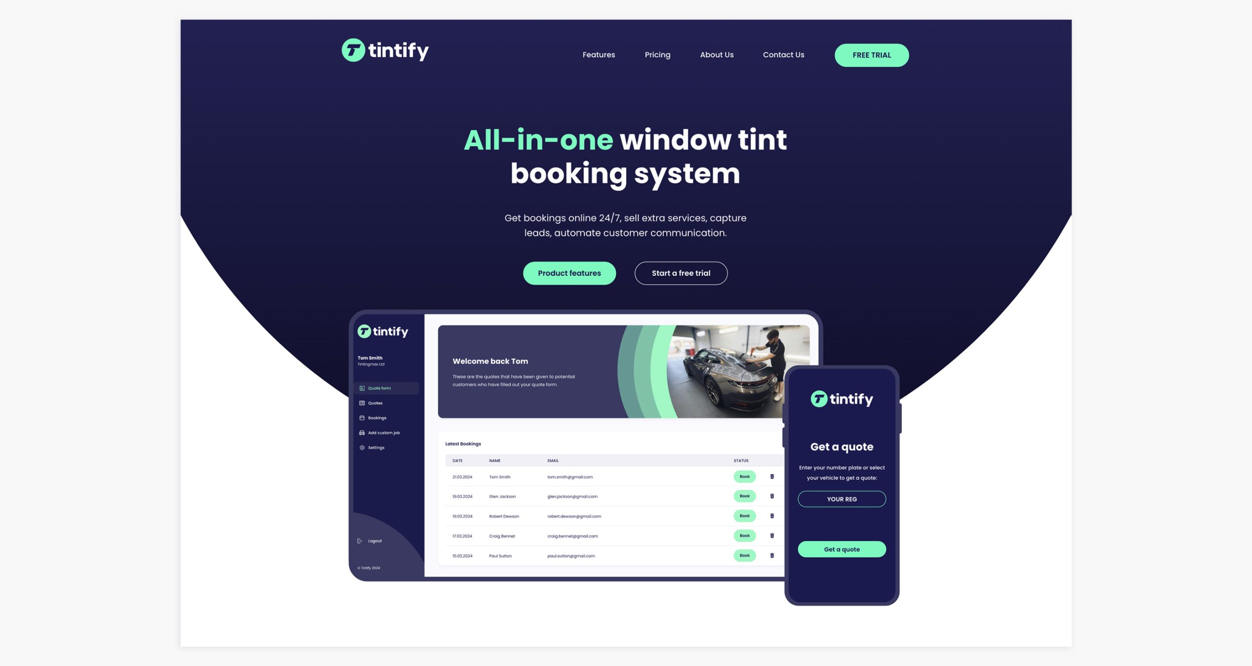
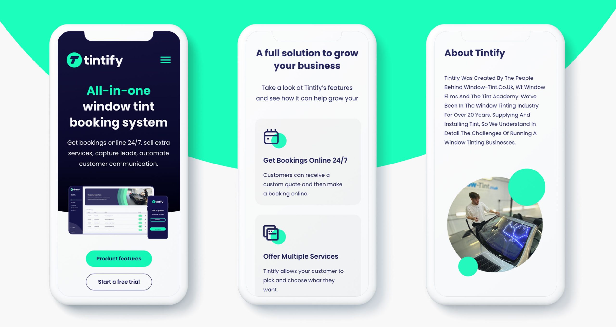
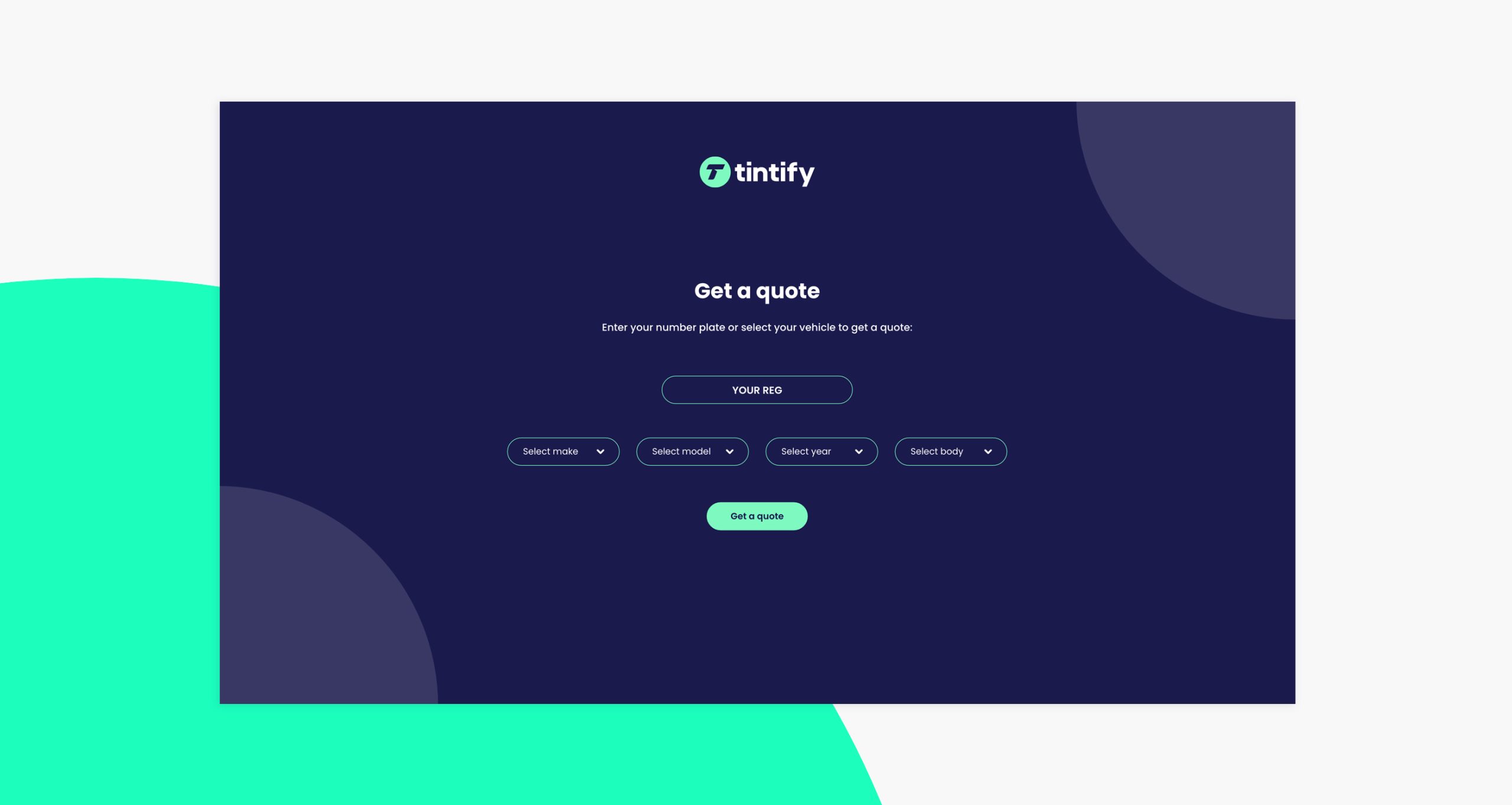
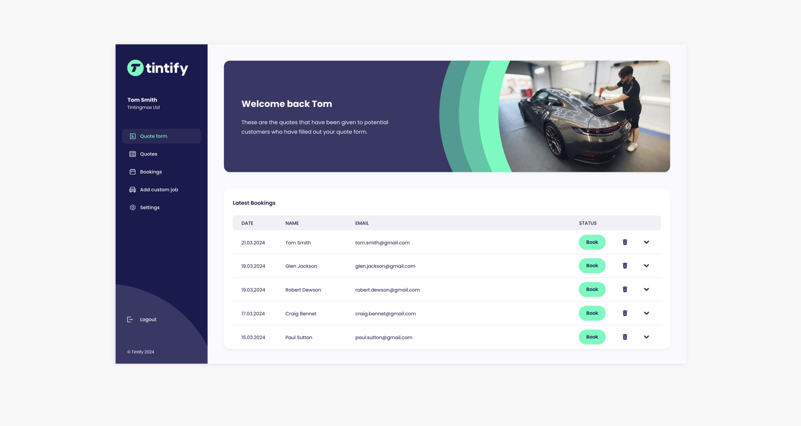
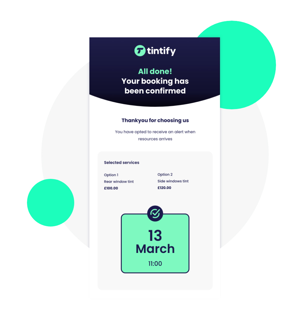
Once the UX stage was complete we created a UI design layer that reflected Tintify’s new brand and complemented our UX design recommendations. The final output of design resulted in a modern, fresh feel with a clear visual language and clean custom assets helping to articulate product features.

