The result
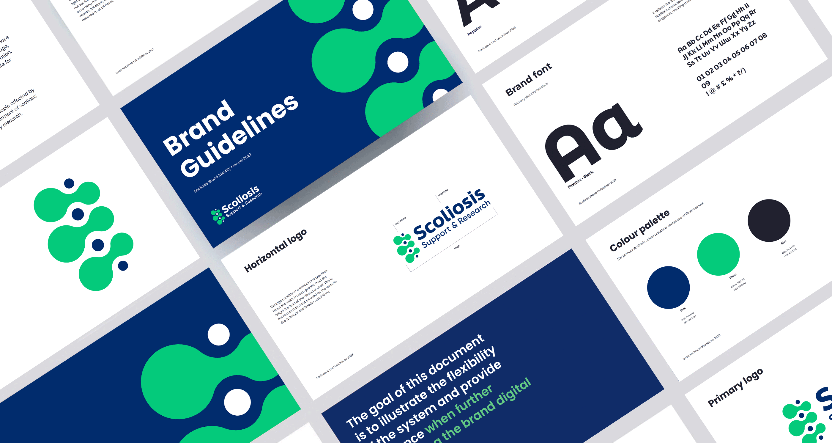
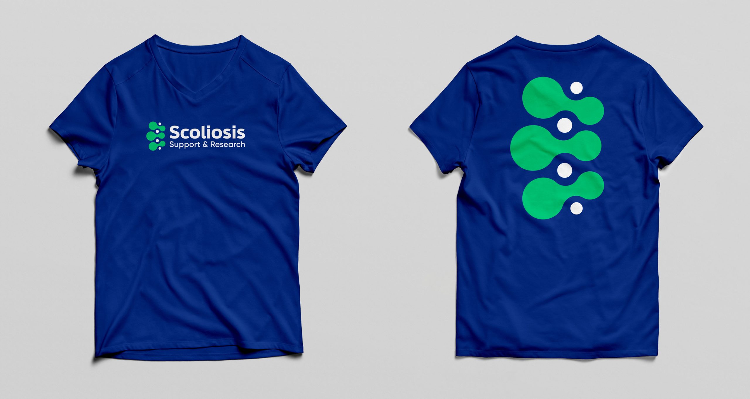
The logo needed a simple expression to reinforce the powerful action statement of the name. We were also mindful that the logo mark needed to sit alongside the national charity name but also stand on it’s own to support various marketing channels. The logo mark is a visual representation of a twisted back bone – signifying the severity of the condition. This was important to retain a visual link to the foundations of the charity.
The colour palette references typical blues and greens used by medical institutions, which in combination with the logo acts as an industry signifier.
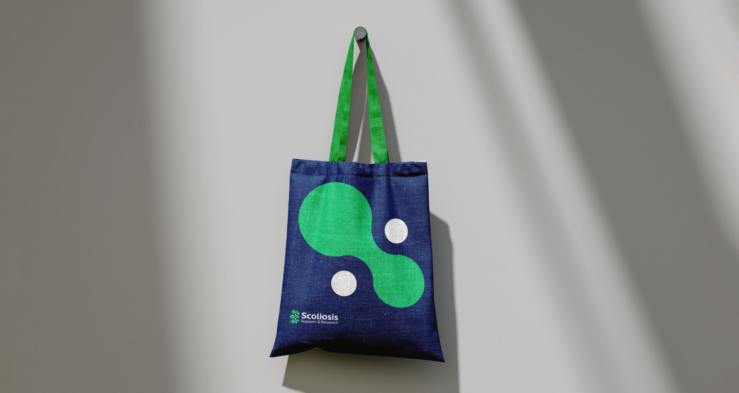
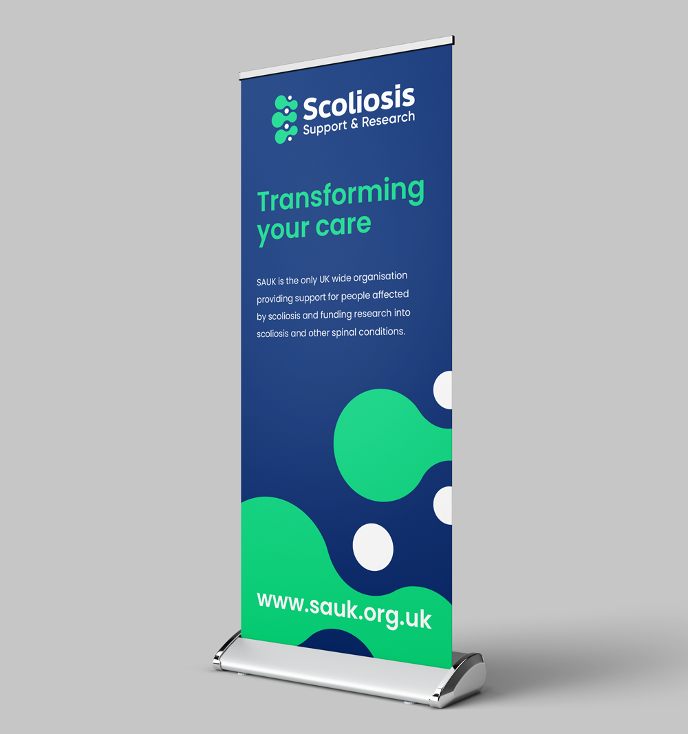
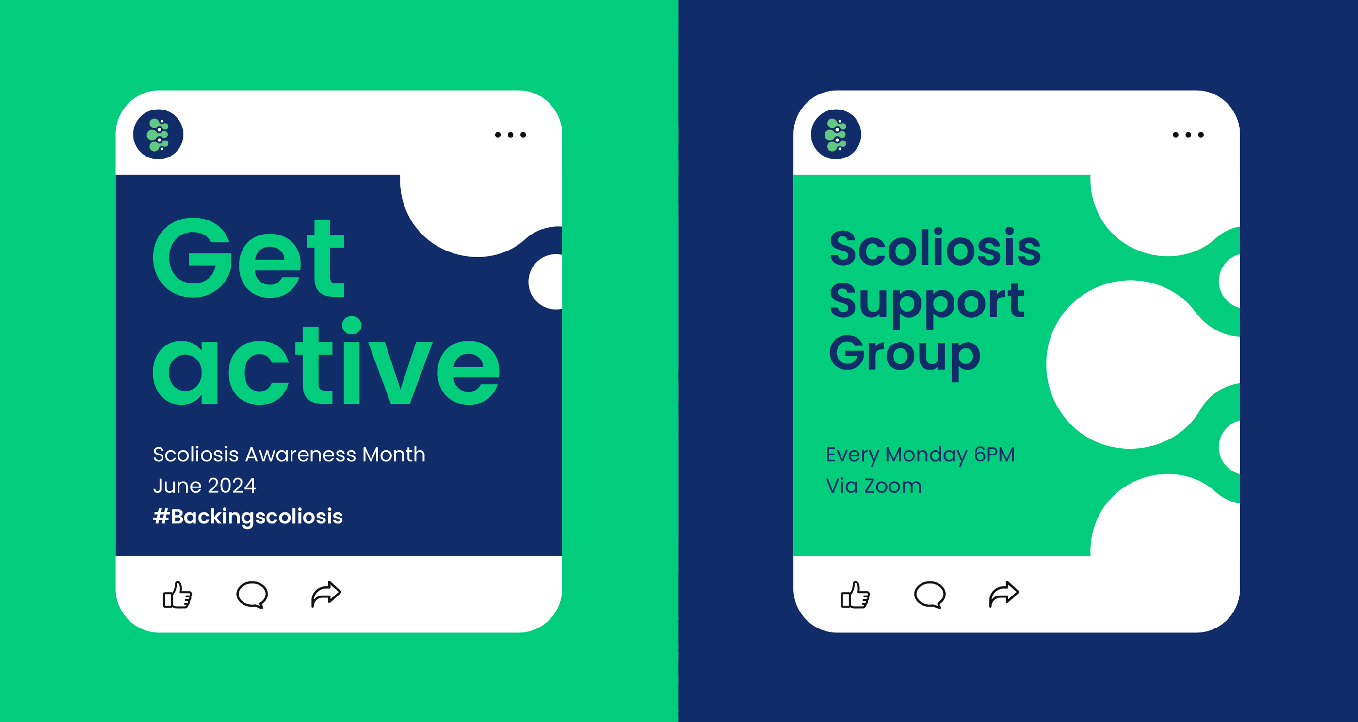
Extending the identity by creating set of a digital guidelines for their Marketing team, including social media profiles, branded apparel, key materials and pull up banners.
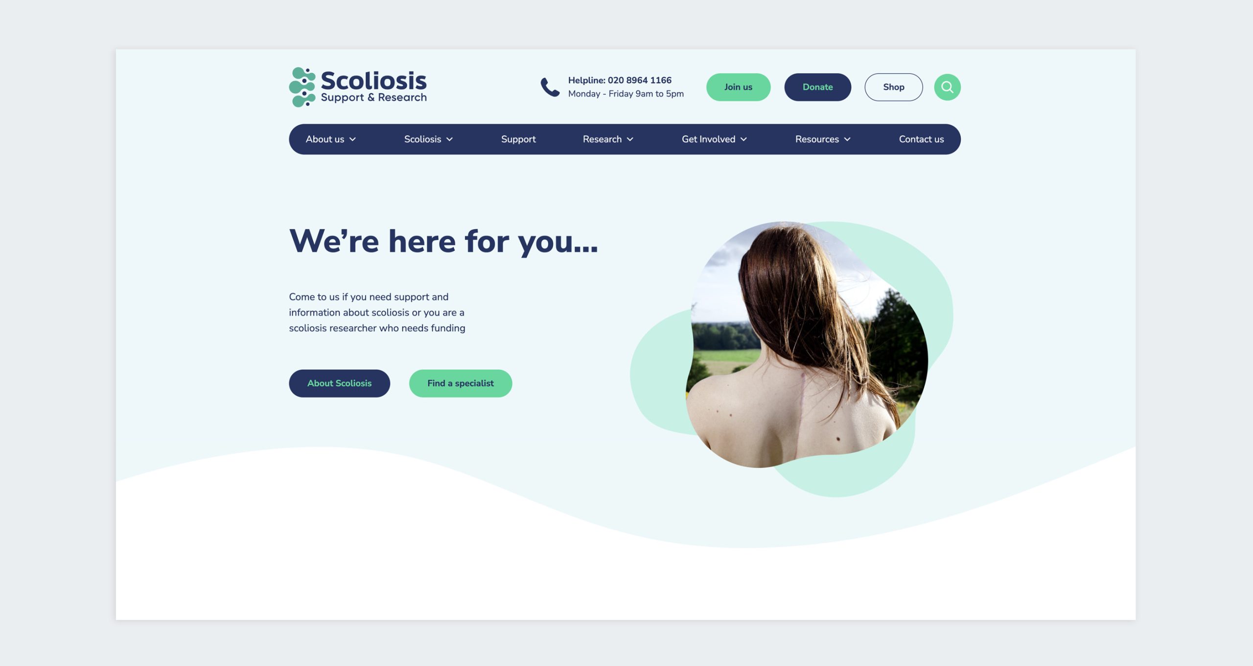
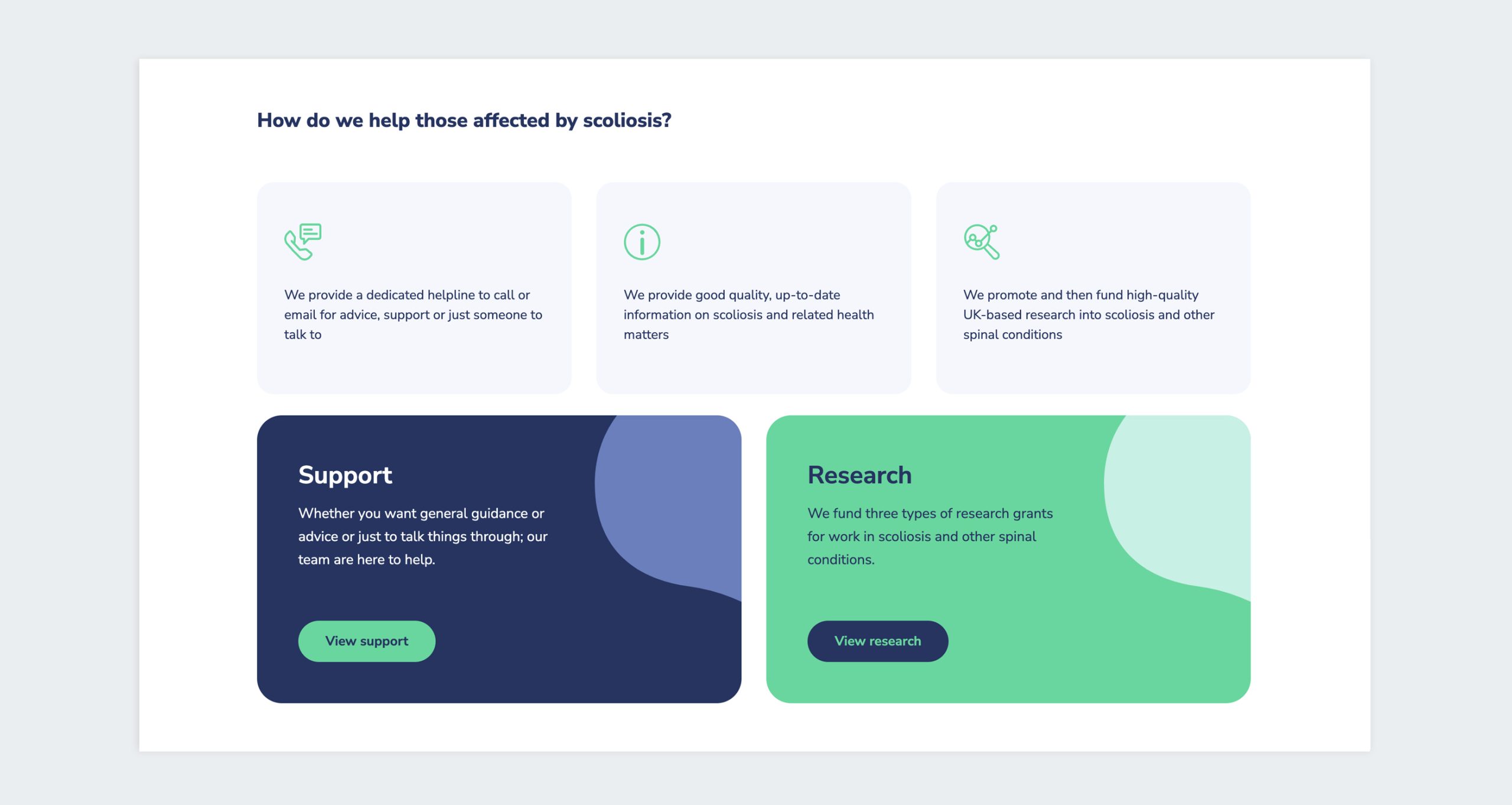
SSR wanted to create a more user-centred website, where people would find it easier to locate the information they needed. JC Creative undertook extensive research to identify users and their needs to create a more intuitive structure.
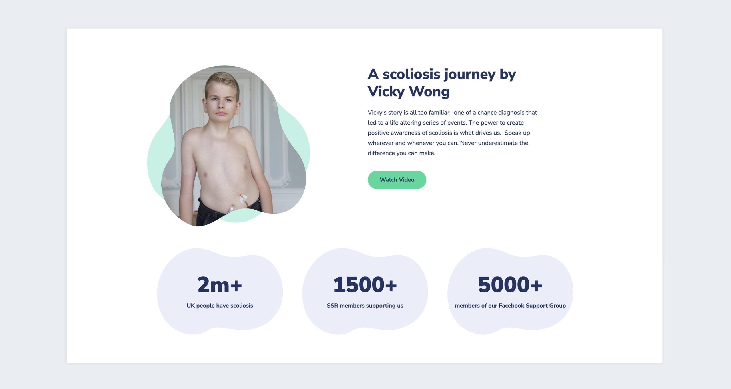
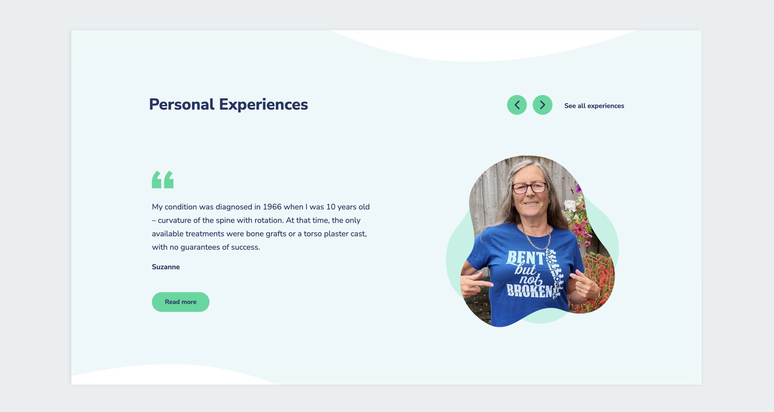
The new website showcases the impact of the world-class research and advances in treatment that the charity supports, whilst attracting new donors and encouraging supporters to further progress their relationship.

