Discovery and research
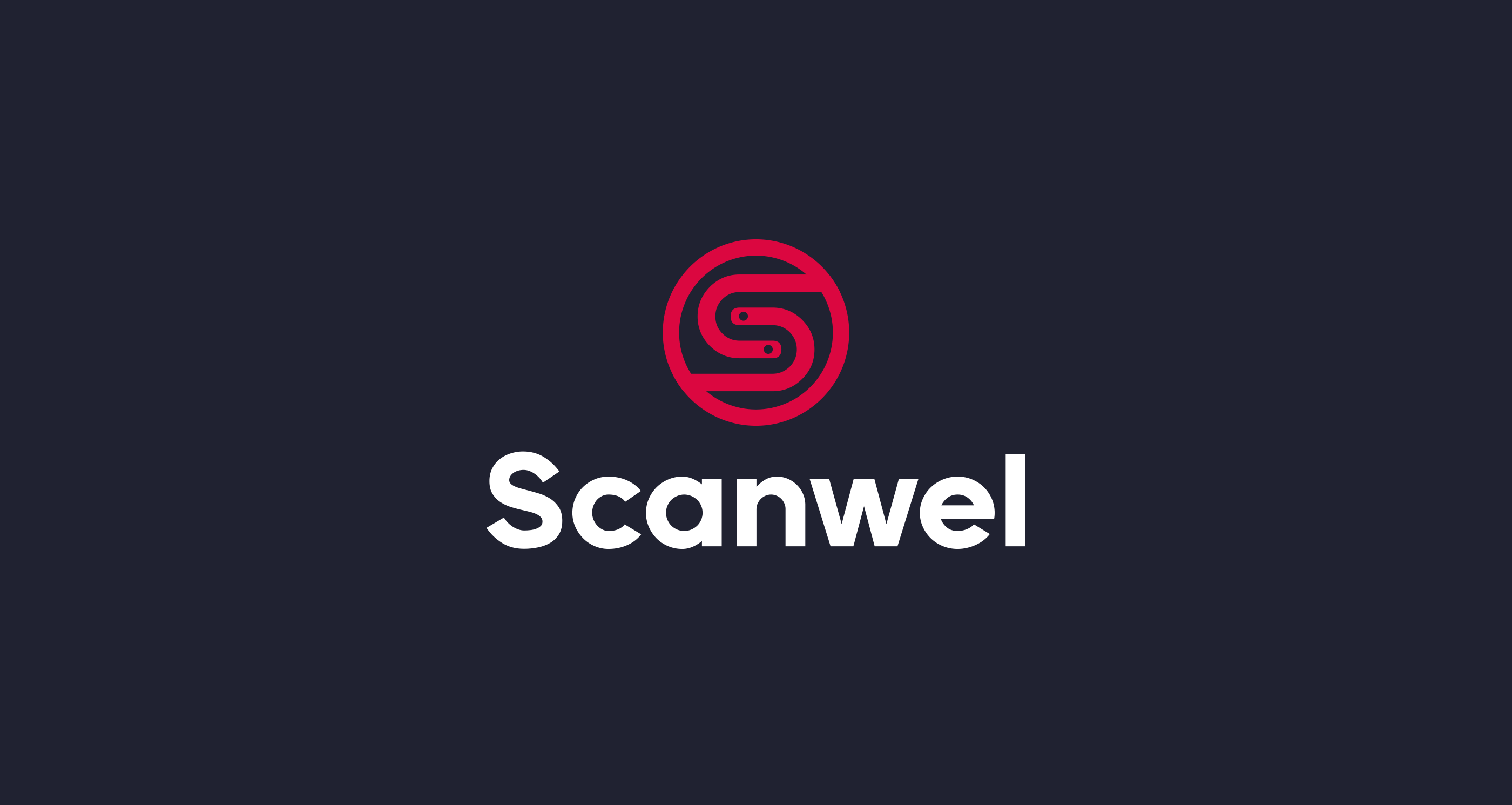
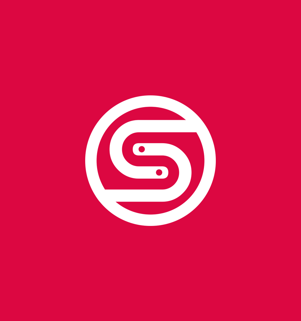
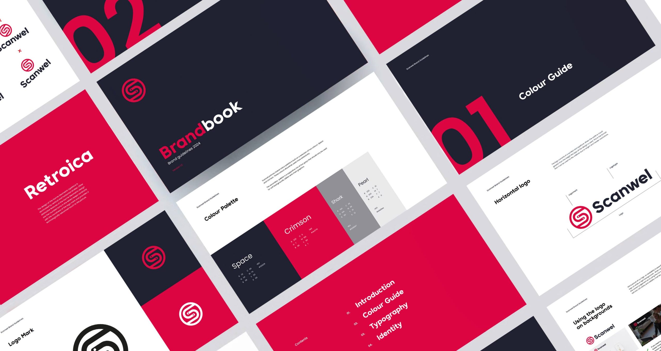
The key function for the logo was simplicity. We created a simple logotype identity that has instant impact. A bold sans serif font was used to give a contemporary look and provide longevity. The ‘S’ at the heart of the design, was angled with two interlocking pieces that forms a full circle, while retaining an element of separation, representing the two shapes working seamlessly together to intelligently interpret the style of products that Scanwel manufacture.
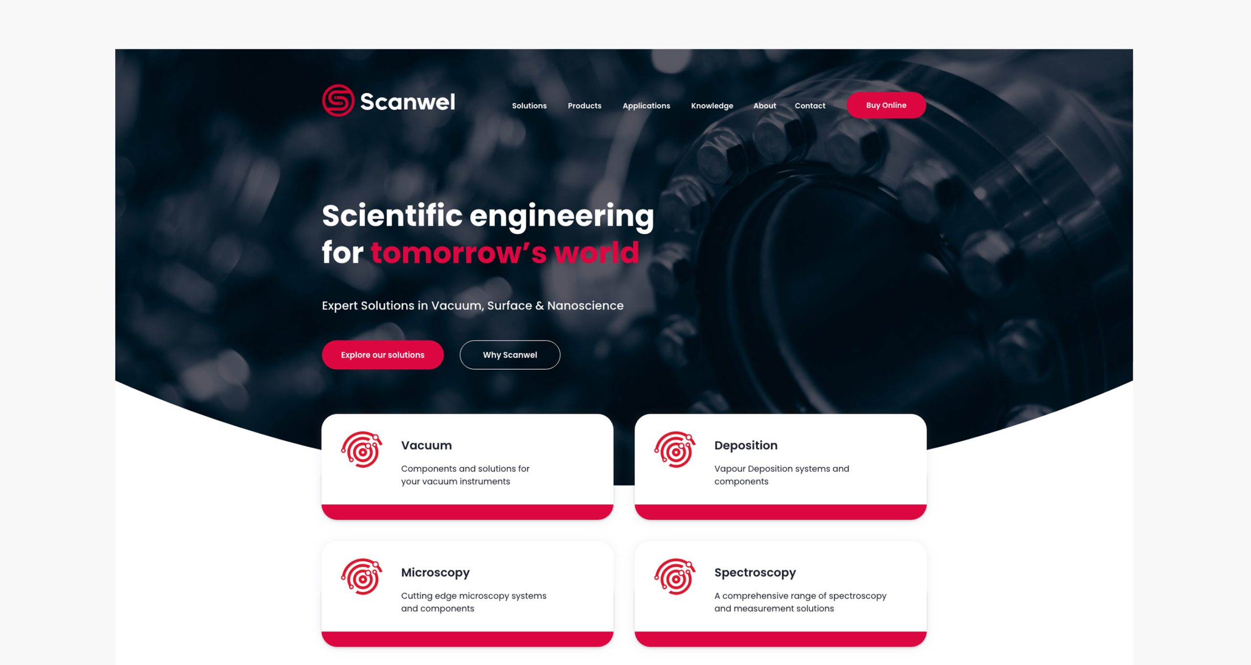
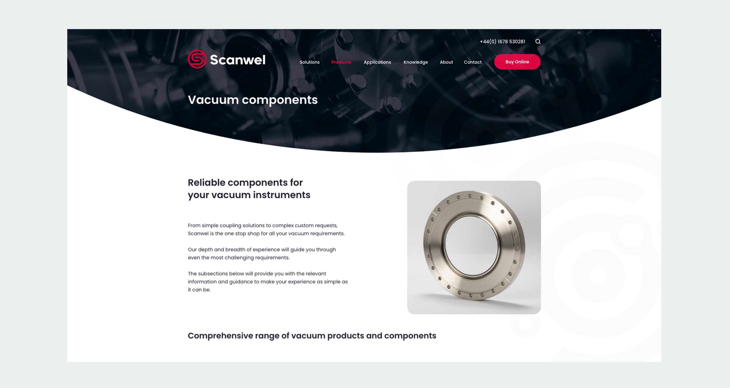
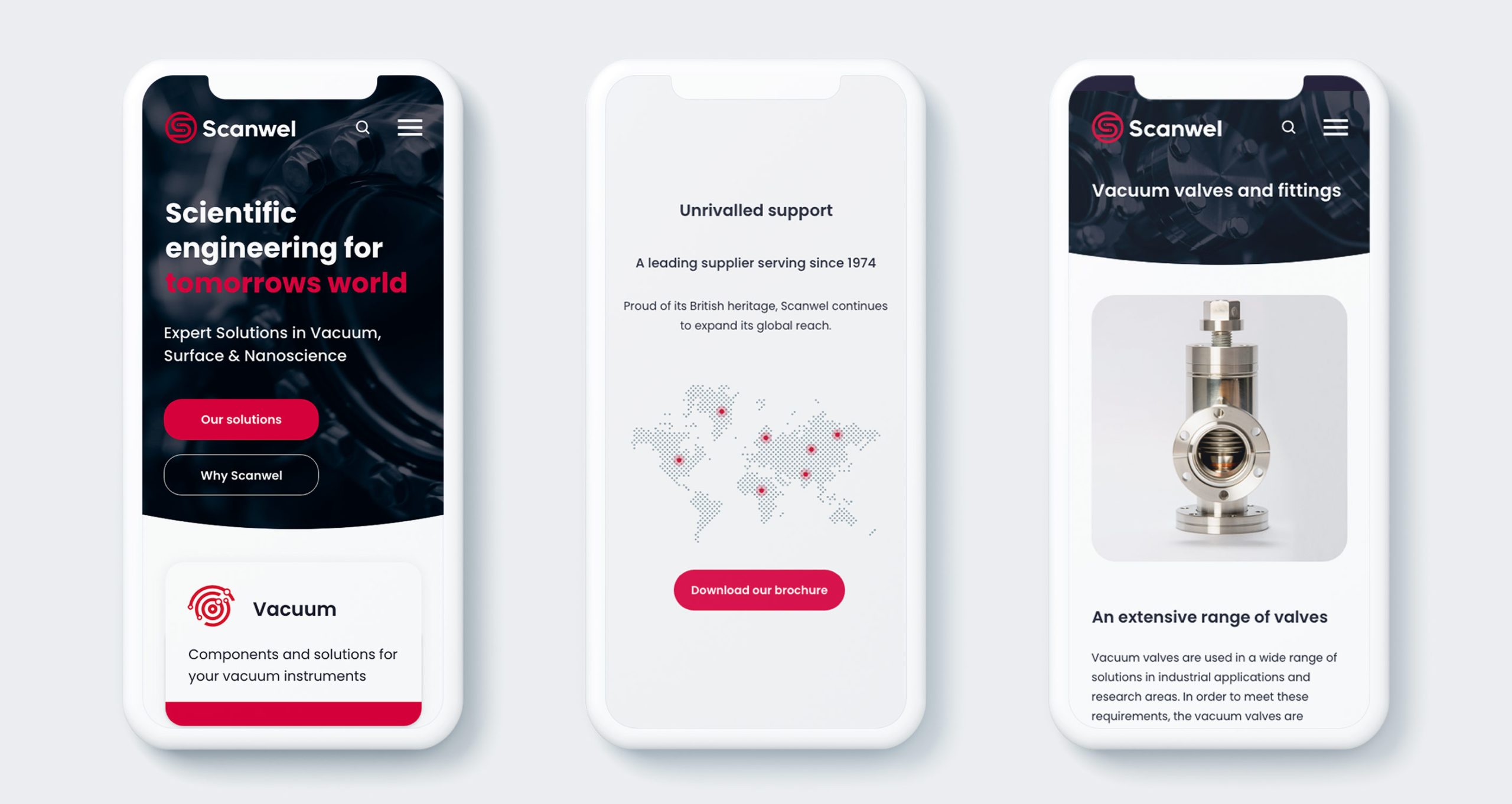
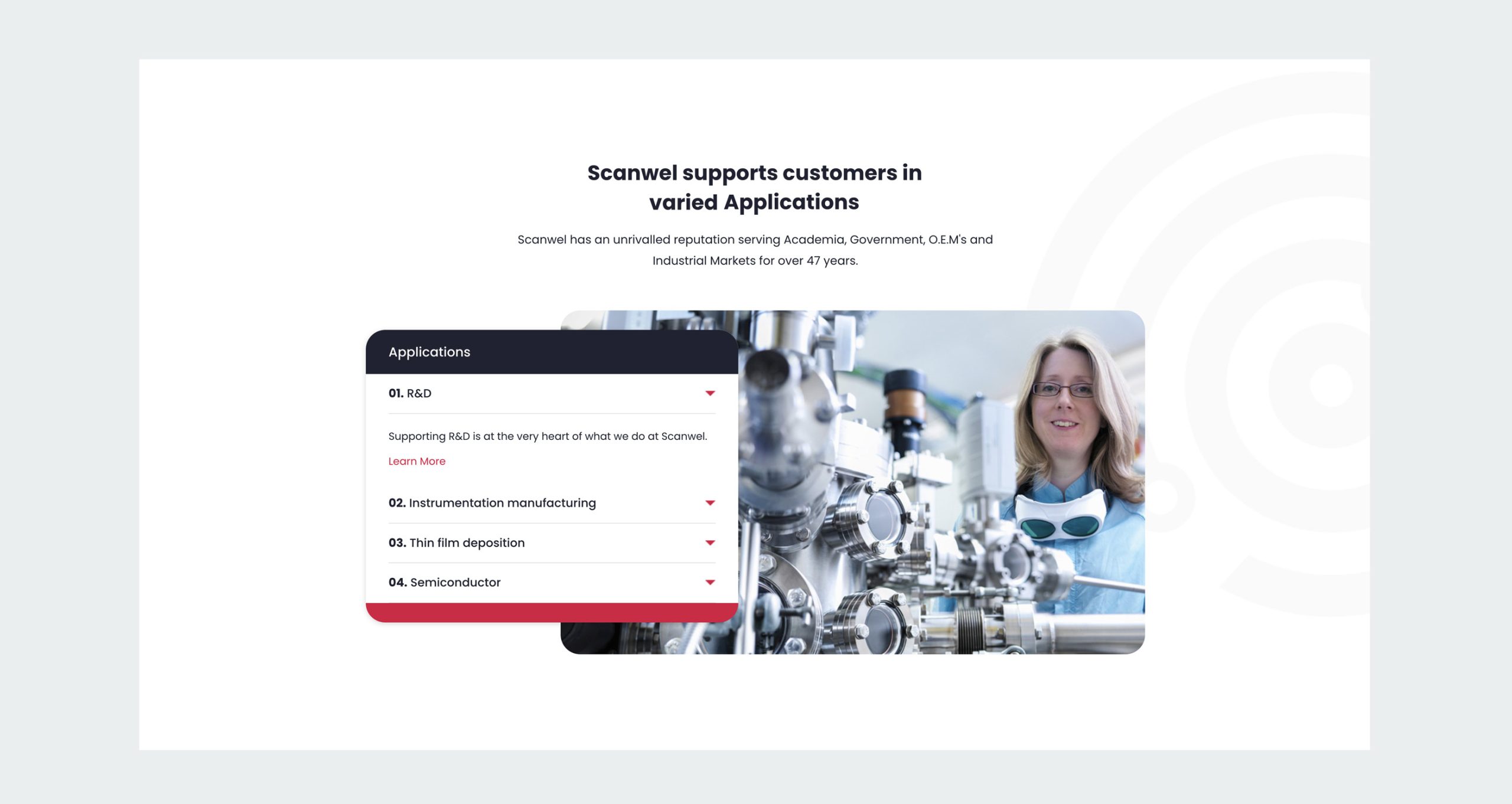
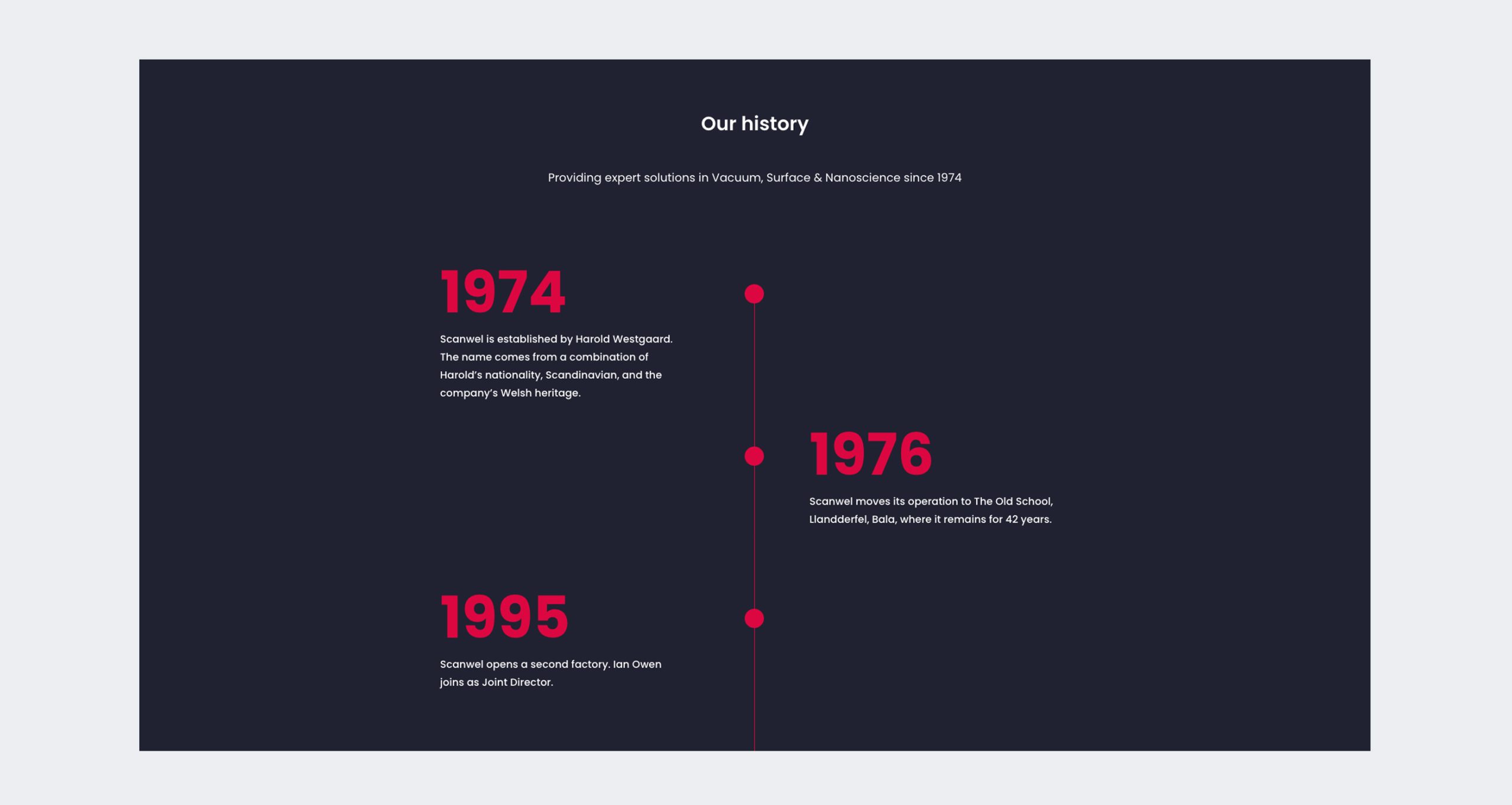
Scanwel needed a new website that would improve potential client engagement and showcase the variety of solutions and products that they offer. The old site had become outdated and was no longer functioning as an effective digital marketing tool. Our key goals were to improve user experience and reduce bounce rate, ultimately increasing website conversions.
We kicked off by conducting a number of discovery UX workshops with Scanwel to gain a better insight into their values and pocesses in order to identify foundations and to determine the direction of their digital plan. We started by working with their internal teams to develop an understanding of the current customer experience from Scanwels perspective. With Marketing, Sales and Technical Support specialists from across the business we mapped out various key stages in the customer journey to establish how the business would address the needs of their clients. This provided a set of hypotheses to explore with our contextual research.
