0
Project overview

The Three Eagles is located in a historic 18th century building on what was originally the main road of Llangollen, Bridge Street.

The inn was originally dubbed The Three Eagles, but was later renamed ‘The Wynnstay Arms’ during the 1920’s. As a fitting tribute to this spectacular building the owners, Matt and Vicky Jones wanted to highlight its historic ancestries by using its maiden name as it soars once again.

We were approached by Matt the owner and Adam the Head Chef to help and support them with a new brand identity.

Scope

Visual Identity; Design; Brand Implementation

Sector

Food and Beverage

The brief

Matt wanted a simple hand-drawn illustrative style that represented the name clearly. We hand drew the eagle to create the required illustration. This illustration uses a fine line weight to add a level of style and balance to the logo mark, which works stylishly against the blue colour scheme.

Essentially, the logo needed to look premium and dependable, show high standards, but also feel adventurous and imaginative.

The result

The logo is simple, timeless and represents the ethos of the brand in the clearest way possible.

We also created a full suite of print for The Three Eagles, including business cards, gift cards, stationery and menus. The menus are housed in a fine hessian material bound cover complete with brass corner edging, bringing a final touch to The Three Eagles subtle luxury.

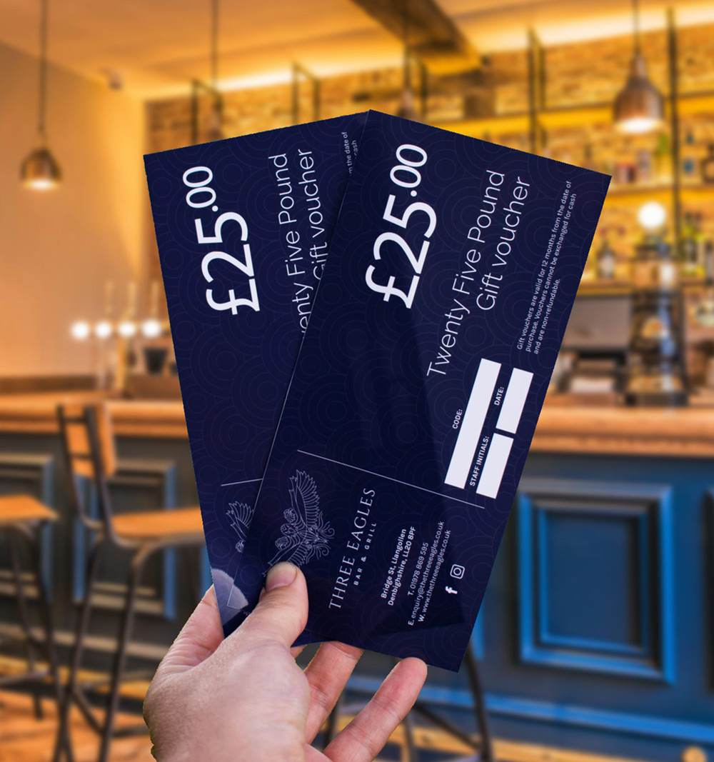
We have always found Jake provides just the right balance of professionalism, creativity and customer service to suit our needs.

Having undertaken a number of branding projects with him he has listened carefully every time to the brief and come up with something that hits the spot across a range of disciplines.

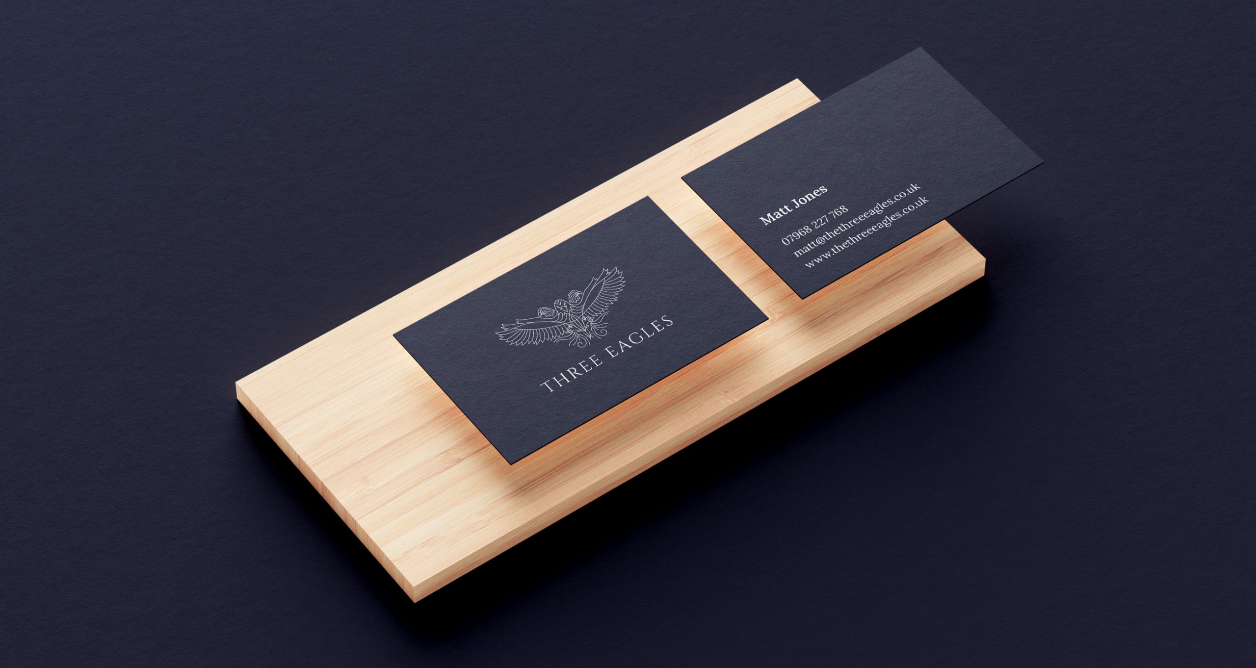
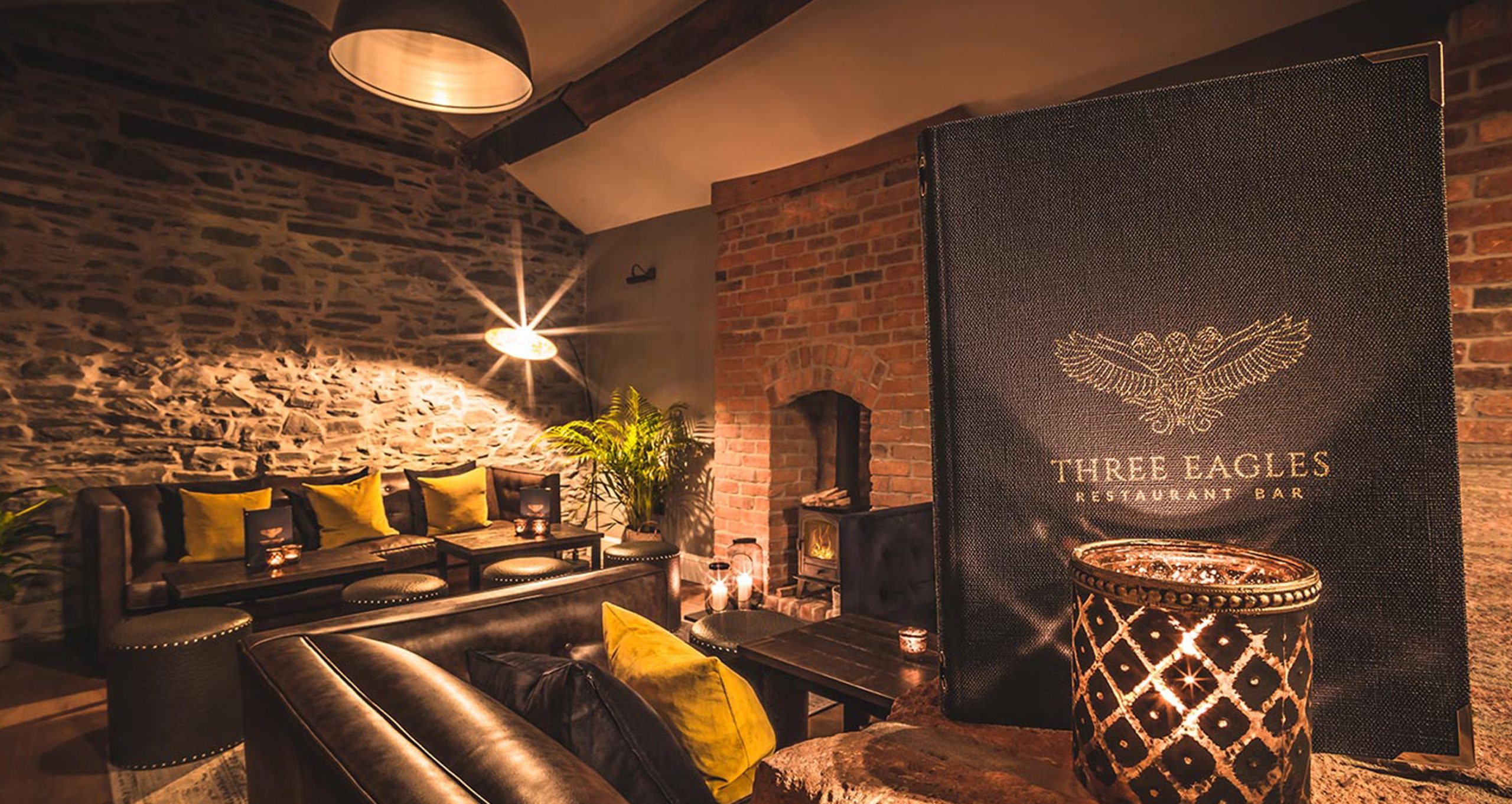
Matt Jones | Owner | The Three Eagles